5 Best Houses to Buy in Calgary (Interior Designer's Review)
" Our kind readers support our blogs. When you buy through links on our site, we may earn affiliate commissions at no extra cost to you."
I recently binge-watched the two seasons of the famous Netflix show Selling Sunset. The dramas and bleating of the real estate women of Oppenheim Group are a great addition to the story; what made me watch the show was the houses that the brokerage sold. Seeing the interior of those houses, which are way too expensive for me, and I can't imagine how someone can afford them, is the show's main wow factor.
As a house designer, I tend to look at a house differently from other people. If it's possible to see the inside of the wall, ceiling, and floor, I would satisfy my design curiosity and the big questions of "Why is that house so expensive?" or "Why is that house not expensive? ". In this blog, I selected 5 of the best homes in Calgary that I thought were too expensive or low-priced and reviewed them from a designer's perspective.
These houses are for sale in Calgary, and my goal is to shine some light on my fellow Calgarians or Torontonians planning to move to Calgary (quite a trend nowadays) who are planning to buy a house or search for their new home in Calgary. Also, this is my review as a house designer, and I'm not a professional real estate agent or someone who is an expert in advising about selling or buying a house.
However, if you're looking for an easy-to-understand guide for home buying in Canada, the book Buying and Selling Homes for Canadians is the perfect book to read. It has a step-by-step guide from home financing, looking for agents, home inspection, and home value assessments to making the right offer. It's informative in a humorous way.
Without making it too far, below are the list of my reviews for the best homes to buy in Calgary.
1) 231 Belmont Health, Calgary Selling for CAD 569,900
Our very first celebrity house (yes!) is a single-family house with three bedrooms, three bathrooms, and just over 1,670 square feet, selling for CAD 569,900. I selected this house because I thought the price was just right (again, solely based on my design perspective) based on the overall design and details of the house. However, that might change once I finish the detailed review. So, let's dig into the details, shall we?
The Exterior of the House
The exterior features a single-front garage which is very convenient during winter in Calgary. It has light-colored accent bricks, dark brown or charcoal horizontal composite exterior sidings, and large sliding windows (I'm assuming they are all double or triple pane windows). I love how the three main windows on top of the garage created that somehow symmetrical character of the front façade. The bricks accent both sides of the garage with a gable roof, making the exterior look stable and strong. Overall, most exterior elements are designed well and complement each other.
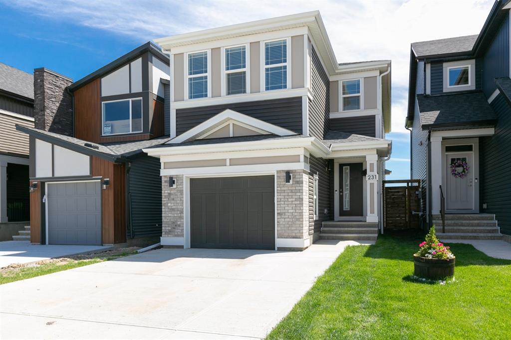
RD Tips: Repainting the existing mocha color exterior walls with white or light grey, exterior siding, and garage door with charcoal or black will make the overall exterior look modern and clean.
The Interior of the House
The well-designed interior of this house caught my attention; the details, color, feeling, texture and intent. They are all present and well packaged that I almost made an offer for this house (sometimes I get overly excited with what I write). This well-lit kitchen, in particular, has a 1.5" thick quartz countertop. I usually look for this in an excellent mid to high-priced kitchen design. It has shaker cabinet doors, a high ceiling with plenty of pot lights (hopefully, they are all LED lights, energy conservation is necessary), and mid to high-end stainless steel appliances. What I love most about this kitchen, besides being clean and with lots of storage, is the marble-looking tile backsplash. The pattern and glossiness of the tiles added an accent texture to the whole kitchen. Of course, it would be nice if they made it a slab-type marble-looking tile, but the existing one is way nicer than the other for-sale houses in the market.

RD Tips: The existing kitchen looks beautiful the way it is, but adding some warm tones will surely elevate the overall look of the space. Minor changes such as replacing the cabinet handle with gold handles and adding rattan or brown leatherette stool will make the kitchen even more sophisticated.
There is nothing special about the living area except that it is a blank canvas with many design opportunities for the future homeowner. The grey wood-looking luxury vinyl planks are a great existing flooring to match modern and contemporary furniture pieces. The massive black leather sofa in the photo should go (agree?).
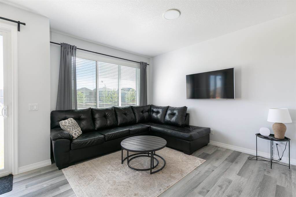
RD Tips: The existing baseboard and other trims look pretty dated and do not go well with the modern vibe of the interior. Replacing it with simpler 4" or 6" high flat MDF baseboards and trims is the best way to achieve the contemporary style.
The dining area fronting the sliding glass door to the backyard is also a great feature of this house. When designing a home, I always make sure that the dining area and kitchen should always receive a tremendous amount of natural lighting. Again, I can't stress it enough, but the height of the ceiling made me want to buy this house.
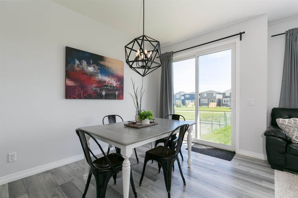
RD Tips: Replacing the existing pendant light with a more sophisticated or a cleaner-looking chandelier or even a black dome light with gold interior leaf will elevate the dining area.
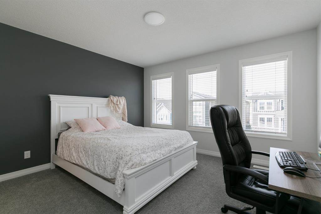
The primary bedroom can use a lot of design love, I'm not saying I hate it, but I don't love it. What I like about this bedroom is the set of windows which gives the room lots of daylight, making the entire space bright and spacious. I also love that the existing dark grey carpet makes it easy to add elements to elevate the room's design.
The Designer's Verdict
For some apparent reason, this house is a steal on Calgary's ever-changing (almost always) house market (again, design-wise). For sure, there are a lot of considerations and market research why they came up with its current selling price, but, from my perspective, this house captured almost all of the design checklist on my belt when looking for a well-designed home.
2) 161 Belmont Boulevard Southwest, Calgary Selling for CAD 629,900
Our second house is quite an eye-catcher because it was previously a show home, so I'm assuming that this has almost all the upgrades from the developer. It is a detached 2-story house with three bedrooms, 2.5 bathrooms, and an area of 1,840 square feet. Mature couples might want this home (maybe I'm wrong) or a single person who loves traveling.
The Exterior of the House
The house's exterior has a front porch, a combination of lean-to roofing, and various window sizes. I prefer laned homes like this one compared to front garage houses. Laned houses have more character and usually vary in design, making them look more attractive. The exterior paint and overall color of the house look so monochromatic (which I love) that it created a character of being organic. The flush somehow helped to mute the deconstructive façade of the house.
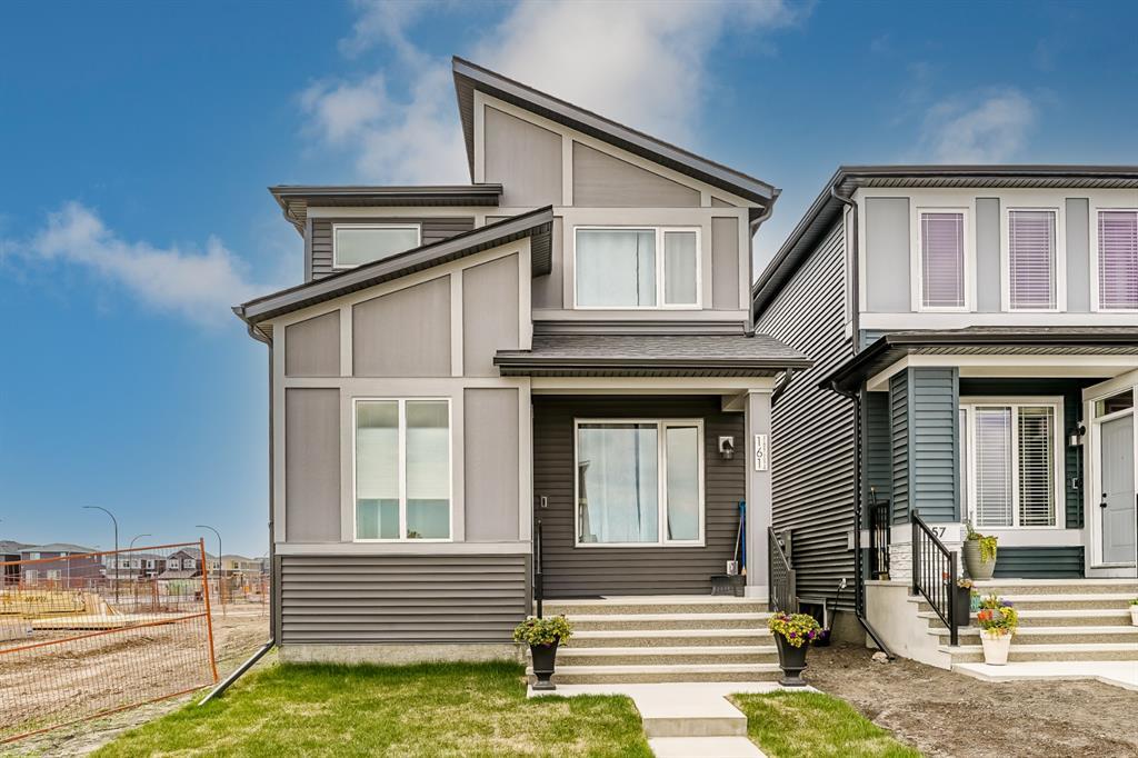
RD Tips: I mentioned that the existing monochromatic exterior color helped to elevate the façade. However, I also thought that adding some black or even darker grey accent colors could add a bit of a texture that is entirely missing on the exterior façade.
The Interior of the House
I love how they brought in the monochromatic brown from the exterior to interior spaces. This space is one of the most sophisticated kitchens in my research. All the existing design elements matched and complimented each other, from the quartz countertop (again, my 1.5" minimum thickness countertop rule is essential) to shaker cabinet doors and panels. The only downside is the lack of space for bar stools. Another plus factor of the room is the set of barn doors fronting the kitchen, I thought it was an exciting feature, and it's so cool.
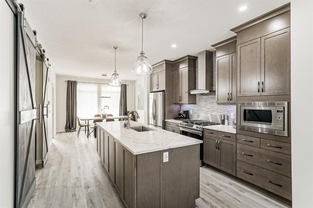
RD Tips: The existing backsplash made the kitchen busy, and replacing it with something simpler that will match the existing countertop will make the kitchen look cleaner.
Blogs that might pique your interest:
-Creating the Perfect Home Office Space
The dining area looks bright and spacious, featuring an oversize window and high ceilings. Like the other house on this list, wood-looking luxury vinyl plank flooring is one of the best overall floorings. You can easily match almost any additional design element, such as a pop of paint, wallpaper, and modern or contemporary furniture pieces. I'm not sure if someone edited the photo, but the existing flooring looks warm and a bit yellowish, but it still looks nice with the existing wall paint, baseboard, and trims.
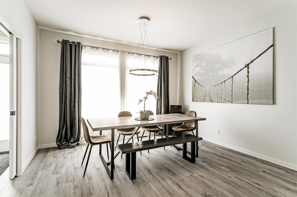
RD Tips: To make the dining area more attractive, adding a feature wallcovering on one or all the walls can be an option. Wallcoverings with subtle patterns and muted cool colors are the best direction to go.
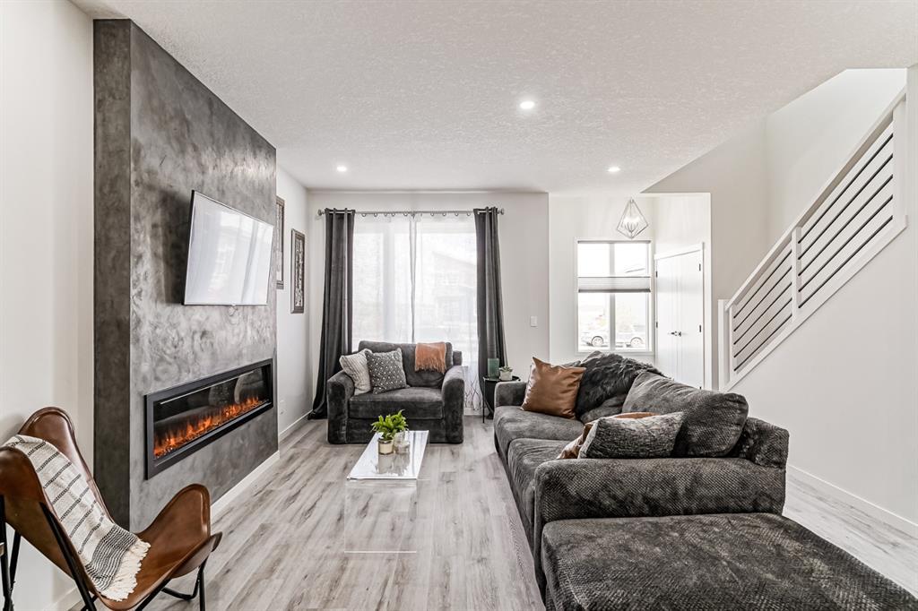
What I love about the living area is the existing fireplace. It's bold, modern, and has a fireplace and an accent feature. Without the fireplace, everything will look so white and flat. Also, I like the mix of wood and metal stair railings, making the entire space stylish and modern. When you finally decide to buy this house, be careful with your furniture selections, you know what I mean, please avoid dark bulky couches.
I recently learned about the fantastic book Probably This Housewarming: A guide to Creating a Home you Adore by Beau Ciolino and Matt Armato. It is probably one of my co-Millennials' most adorable and relatable home guides. Check it out and read this book before you get your brand new house key; you'll learn from their fun ways of homemaking to your very first housewarming.
The main bedroom looks spacious and can use more or an oversize window. The existing floor finish, a luxury vinyl plank, is a minor disadvantage. I would love a carpeted floor in a bedroom but also think that other people would like this type of flooring in their bedroom (luxury vinyl planks are easier to clean and have less maintenance than carpet flooring).
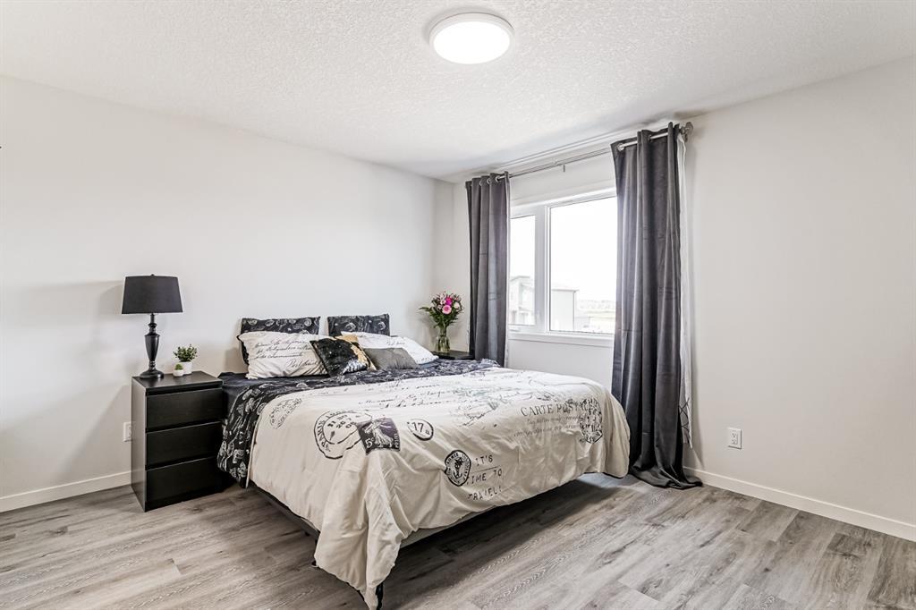
RD Tips: The same with my RD tips for the dining area, the application of wallcovering as a feature wall or a pop of accent color can easily elevate the design of this room. Too many white and bright colors make the room flat. Adding some pattern and color will create texture and make the space more exciting and stylish.
The Designer's Verdict
Without all the upgraded features of this house, I would say that it is pretty overpriced. However, will all the existing features and overall design, the selling price is reasonable. I like how consistent and cohesive this house's exterior and interior design are. Honestly, I wouldn't make any significant changes to this house because it is well designed and beautiful.
3) 67 Legacy Woods Bay Southeast, Calgary, Selling for CAD 715,000
Our house number 3 is a bungalow-type home with three bedrooms and 2.5 bathrooms over 1,200 square feet. The first impression was that the price was overly high, and I thought I would include this on the list to prove myself wrong. Also, I think it has a lot of interesting characters for a bungalow house that is different from other houses in the area.
The Exterior of the House
I think the house's exterior character will attract mature buyers, families, or couples. The outside of the home features a two-car garage and a combination of a dutch gable roof. It also has dark-colored bricks and accent moldings, creating a bold and distinct house character. I like the dark exterior façade and the use of a lighter tone as an accent. The overall design looks durable and quite timeless.
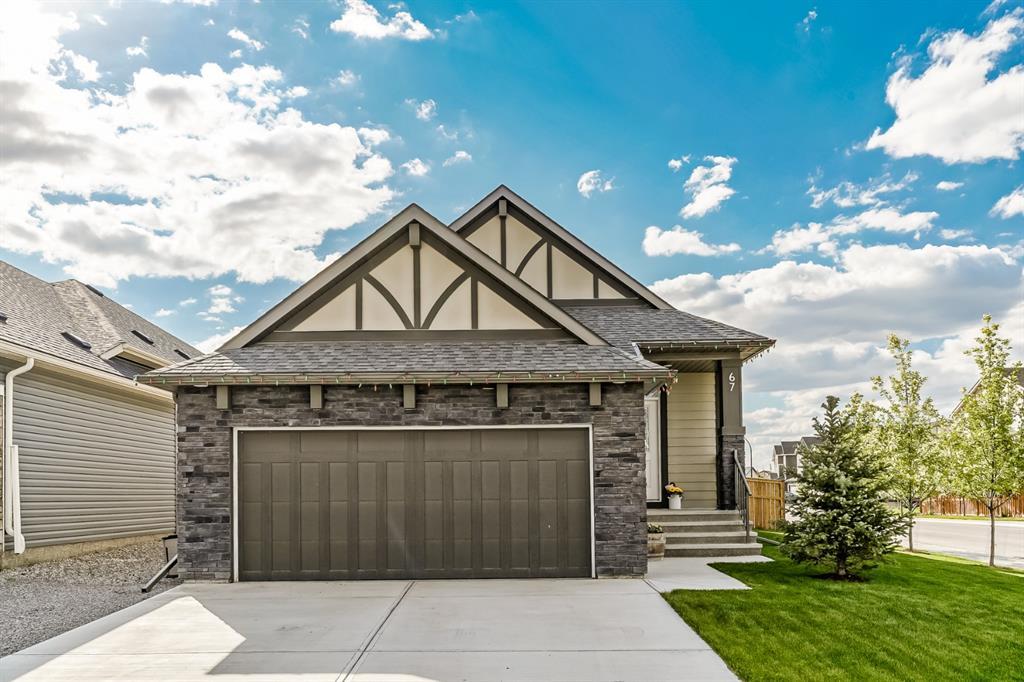
RD Tips: If modernizing the overall exterior design is the goal, then replacing all existing dark brown paint with charcoal or dark grey paint will do the work. Also, adding exterior wall lights on both sides of the garage door will elevate the look and texture of the existing bricks during nighttime.
The Interior of the House
I'm not sure why some houses in Calgary have brown as an accent color, but I thought this kitchen could use some punch of colors. I like how simple this kitchen layout is and how the quartz countertop complemented the existing herringbone-patterned white backsplash tiles. The only drawback is the location of the built-in microwave oven and the current type of range and hood. I can surely use an upgraded version of these appliances with the selling price.
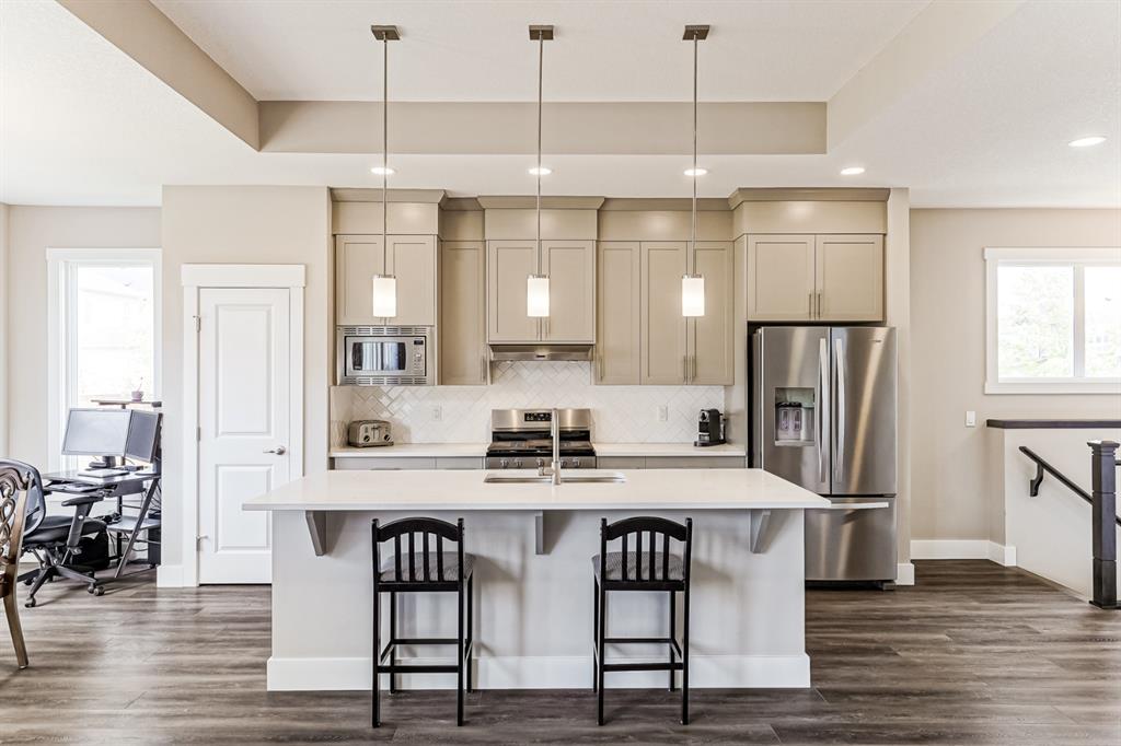
RD Tips: To upgrade the overall kitchen design, an option for two-tone cabinet paint can be a possible option. White paint for the uppers and dark grey or blue for the base cabinet; if you want to make it bolder and punch some color, then dark blue or grey for both uppers and the base cabinet could be the best solution. Also, replacing the pendant lights with a single horizontal chandelier or a cluster of dome lights can style up the kitchen's overall design.
The dining area has so much design potential to it. The amount of natural lighting making the entire space bright and spacious is more than enough to make this area stand up. I love the big windows and the existing wall baseboards and trims. With the current molding size, you'll know it's not cheap.

RD Tips: A built-in bench or a buffet cabinet can fill the existing awkward area with the computer desk. Introducing a bold patterned wallpaper with the muted color of green or blue can quickly spruce up the design of the space.
The existing step-up ceiling in the living area is one of the house's best features. It is a clever design feature to make the interior spacious yet not sacrificing the simplicity and cleanliness of the space. Though the fireplace looks heavy, replacing the black surround tiles could be a possible solution. The open layout also made the interior bright, airy, and big.

RD Tips: Replacing the existing fireplace tiles with either a white marble slab or light concrete-looking tiles is a possible solution to remove the heaviness of the fireplace. If going modern or contemporary style is the goal, changing the wall color to a more bright white paint such as Chantilly Lace by Benjamin Moore is an option.
As an interior designer, sometimes it's frustrating to design around an existing window, especially when you hate the location of that current window. You know what I mean, right? Moving an existing window is considered significant renovation work, and you don't want someone to spend that much money just after buying their house. This bedroom has so much design potential; minor changes will work, such as changing paint colors and furniture pieces. I love the 6" high MDF baseboard and the existing light brown carpet flooring in the room; somehow, it made the bedroom look bright and spacious, even with small windows.
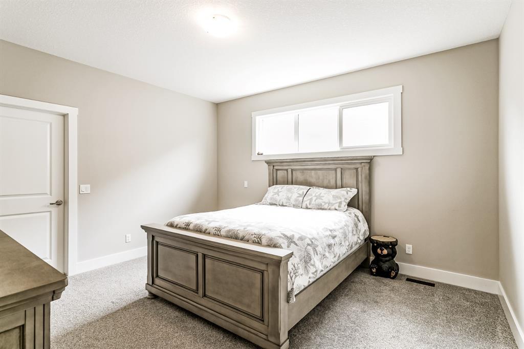
RD Tips: Using a contemporary style bed and other furniture pieces will freshen up this bedroom and patterned wallpaper (something playful) on the wall with windows.
The Designer's Verdict
I thought that the selling price was a bit too high. However, the house has many design opportunities that the buyer can play with, both interior and exterior. Also, I like the open layout of the kitchen, dining, and living area, as well as the oversized windows making the interior airy and bright. Honestly, this is one of the best bungalow houses in my research, but please let me know if I'm right or wrong about it being overpriced.
4) 6051 Dalcastle Drive NE, Calgary Selling for CAD 800,000
Home Listing via Calgary Homes
Our fourth house is an upscale 1974 detached 2-story house with three bedrooms and 2.5 bathrooms and an area of 2 636 square feet. What caught my attention about this house is its massive square footage, interior finishes, and potential for more design upgrades, yet still below the 1M price. I'm crossing my fingers that there is so much more about this house other than what I mentioned.
The Exterior of the House
The house's exterior features a modern version of a 1970's home. It has its little driveway, and I love the façade's color combination of brown, black, grey, and green. I'm assuming all front vertical windows are fixed, and the three windows on the second floor are sliding. Fixed windows can be inconvenient during hot seasons. I don't know if you'll agree, but I find the house's overall look very mysterious; so much history has happened but in a good vibe.
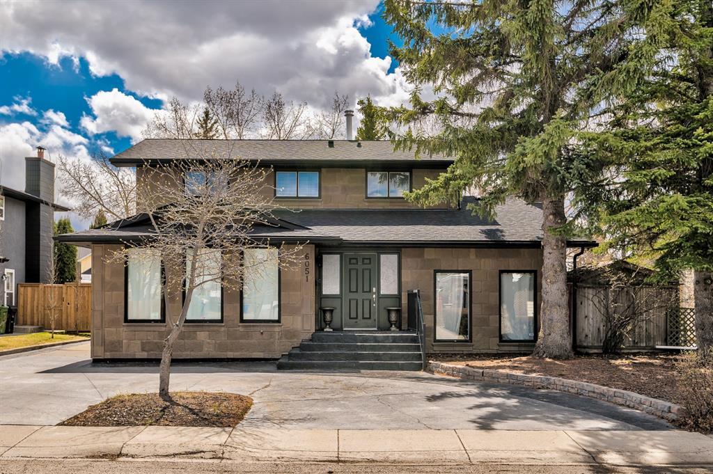
RD Tips: The exterior looks charming; adding fixed plant boxes below the three vertical windows on the left is a good idea to soften the existing stone cladding exterior walls. Some lovely black or brass wall lights in between the vertical windows will elevate and modernize the current exterior design.
The Interior of the House
The kitchen is where I saw lots of design opportunities. They renovated the space with a new countertop, cabinets, and appliances. I'm not sure if the flooring is also brand new. The only thing I don't like about the kitchen is the fridge's location, as the space gets too tight with the edge of the countertop. Also, the small windows are a bummer; an oversized window is a suitable replacement if a renovation is an option.
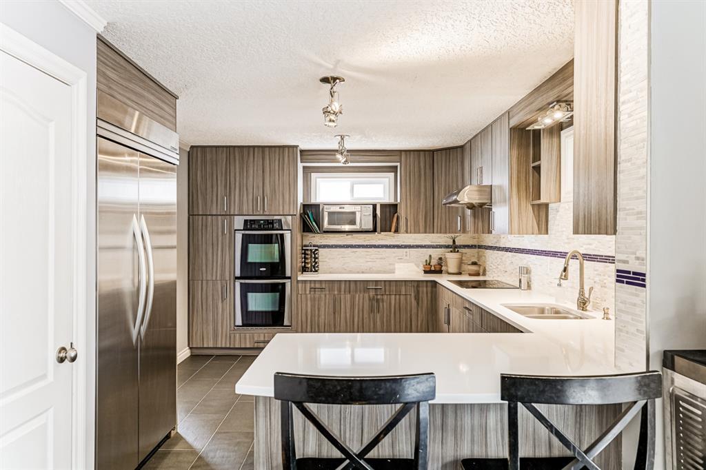
RD Tips: White subway or glossy ceramic mosaic (hexagonal or triangular) tiles are possible replacements for the existing backsplash tiles. The existing cabinet laminate looks busy, and simple or playful white or bright tiles will trick down the laminate wood pattern. Also, I know it's a costly renovation, so making the existing windows big can make this house a million-dollar listing.
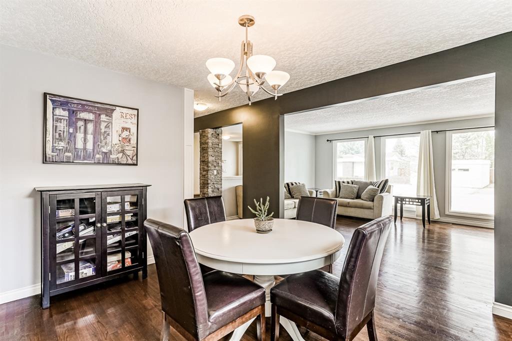
The dining area looks spacious and extraordinary compared to other 1970's houses in Calgary. The space is open to a hallway and entertainment area yet still looks private and secluded from other rooms. I like the rustic feel of the existing floor and the current direct access to the kitchen.
The existing floor finish continues to the living/ entertainment space, and the existing moldings on the wall look gorgeous. It can turn the room into a magazine-worthy living space. I also love how big the three windows are, fixed or not; they look great with the area, plus the extra amount of natural lighting they let in is so beneficial.
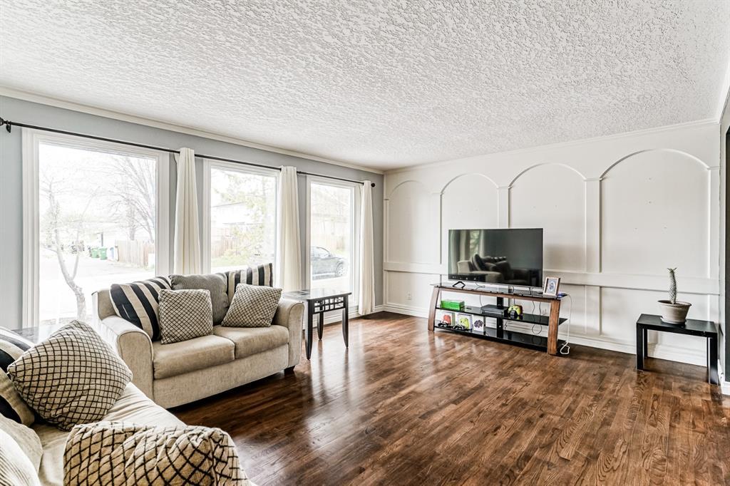
RD Tips: The existing wood flooring for dining and living areas looks terrific. Painting all the walls, molding, and trims with white (not as white as the ceiling) to hide or mute the intricacies of existing moldings will modernize the interior. Also, adding more black and gold accent pieces or decorative lighting will make it more sophisticated and stylish.
The Designer's Verdict
This house is a designer's house, maybe the type I want to redesign. I'm not saying that I hate its current design, but I just saw and imagined a lot of design possibilities that will turn this house into a work of art. For me, this house is an excellent investment if you are someone who loves interior design.
5) 2416 25 Street SW, Calgary Selling for CAD 970,000
Home Listing via Calgary Homes
Our fifth and final house is a semi-detached, 2-story house with four bedrooms, 3.5 bathrooms, and an area of 1,808 square feet. I included this house because I thought it was overpriced for a semi-detached house. There's only one way to find out.
The Exterior of the House
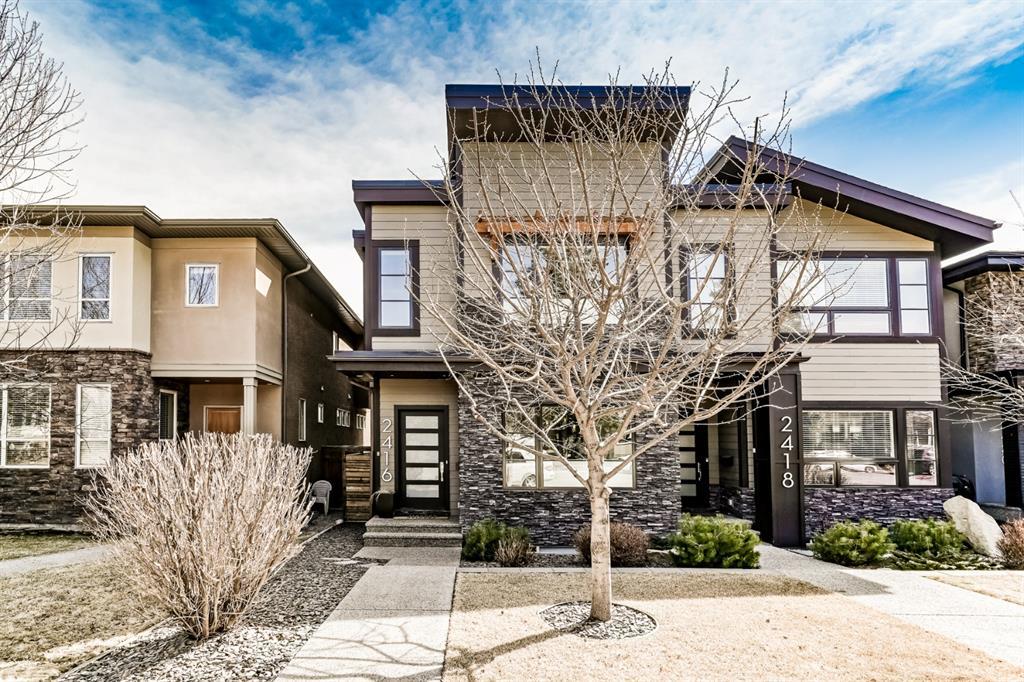
Why do people love hiding their nice-looking houses behind a tree? Well, ask the Architect or Landscape Architect. It is 2013 built house which means that it's pretty much new. The exterior façade features accent dark grey bricks and horizontal composite exterior panels. I'm not a fan of the pergola accent on the second-floor window (it looks like an afterthought), but the buyer can easily remove it. What I like about the exterior façade are the roofing structures; it's not identical to the other attached unit.
The Interior of the House
Now I know why the selling price is CAD 970,000. The interior finishings look amazing, expensive, and upgraded. I like how open the layout is, from dining to kitchen and living, as well as the windows and door opening on both ends. You'll have both the benefits of ample natural lighting and cross-ventilation for passive cooling during summer. However, I wouldn't say I liked that there is no tile backsplash (I know there is an existing stainless steel backsplash for an industrial look and splashes), and a lot is going on with the wood laminate and white cabinets.
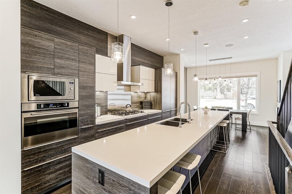
RD Tips: The kitchen can use some lovely white tile or marble slab backsplash, also, replacing the white upper cabinets on both sides of the range hood with floating shelves will soften or lighten the kitchen's overall design.
Aside from being an open plan (which I prefer in my designs), the flooring and stairs are some of the excellent existing features of the house. The dining area has a massive window for natural lighting, and the entire main floor has a high ceiling very much suited for decorative pendant lights.
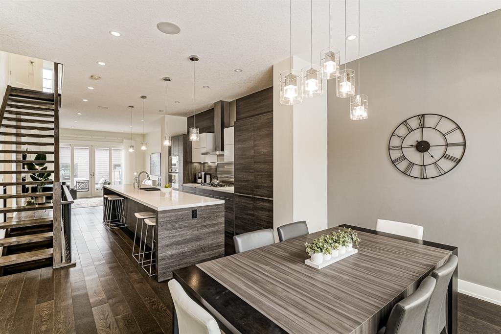
The living area has an existing fireplace and adjacent sliding glass doors to an existing patio. As I mentioned, this house receives a lot of sunlight during the day, which is a significant plus factor if you adore sunny days. I like how cohesive the flooring is with the stairs and handrails; it speaks contemporary and farmhouse simultaneously.

RD Tips: The interior spaces can use some pop of colors on furniture pieces or even on wall paint or other colored wallpapers. Right now, it looks muted and cold; soft furnishings with subtle blue, yellow or green colors can soften the vibe.
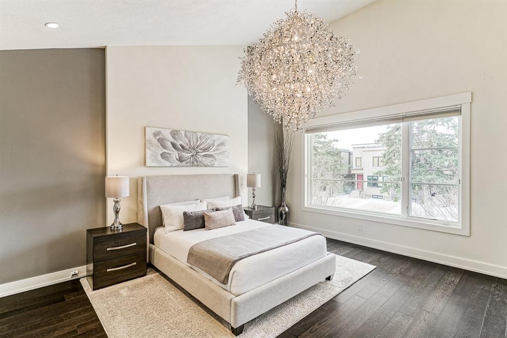
I love the primary bedroom (I'm not into the chandelier, though) with its oversized window and high slanted ceiling. There is also a reading space in the room which, for me, is pretty awkward but can be utilized. There is so much to love in this room except for the floor, which doesn't have carpet.
The Designer's Verdict
I thought that the selling price is fairly right considering the overall design and all upgraded finishes. If you have the budget, then this home is a perfect find amongst some of the best houses for sale in Calgary.
Trust me when I say there are tons of beautiful houses in Calgary currently on the market; it's a matter of your needs, wants, goals, and tastes when deciding which one to buy. I tried to include as many houses as possible, but I don't want to turn this blog into case studies you find in the thesis book (I can, but I don't want to give you a headache). I hope this blog gave you ideas of what to look for in a house in terms of designs. Please let me know in the comment box below if you have any questions or concerns about house hunting in Calgary; it would be a pleasure to answer your design questions.
Thank you for stopping by and reading my blogs. My goal is to impart more than a decade of design (primarily interior designs) knowledge and experience through reviews, tips, inspirations, and DIYs. I hope you enjoy your time here as much as I enjoy writing my blogs; feel free to comment below, email me at rbutaran@rocabudesigns.com, or subscribe to our newsletter for fresh blog updates.
Together, let's create meaningful and beautiful spaces.
Ron

3 comments
It’s wonderful to know that Canadians like myself can fulfill a dream of owning a house or condo on Maui. I value the advice and insights you provided in this article, from knowing your local real estate market to hiring an experienced representative who can guide you through the procedure. Could you please tell me about the average expenses that will incur while purchasing a property in Maui?
Hi Pam,
Thanks for visiting our website and spending time to read my blog. I’m happy you like my reviews and design tips. I will be posting more DIYs, tips, reviews and everything interior design blogs soon, we also have plenty of blogs on our design journal page. Good luck with your move to Calgary and stay safe as well.
Also, feel free to sign-up in our newsletter so you’ll be updated whenever we release new articles. Thanks!
Hi there,
I found your blog from one of my google search when I’m doing my research on housing in Calgary. I’m from Toronto and we’re planning to move to Calgary soon, I love how you blog your thoughts about designs of some of the available homes in your area plus the design tips. Thanks for sharing and I’m excited to read more of your design blogs. Stay Safe!

