9 Best Color Green Finishes to Use in Any Room

" Our kind readers support our blogs. When you buy through links on our site, we may earn affiliate commissions at no extra cost to you."
Sunny days are finally in Calgary; this is the best time to go outside and do all the summer activities you've wanted. We have lots of lined-up activities for the summer, and trust me when I say that you need to hurry up and don't waste time while it's sunny; before you know it, it's winter again.
Yesterday, we went for a breezy walk, and I was so happy (like a child) when I saw the entire landscape was green again. Trees look alive, flowers bloom, and shades of green are all over the place. We're lucky enough to live in an area near a path walk that leads to a river (an actual river), so during the summer season, walking and experiencing nature is our treat after a long day of work.

For me, the color green and nature relate to each other, and I'm sure it has something to do with growing up in a tropical country. I developed a love and hate relationship with the color green while designing various residential and commercial projects in the past. Through time, my style has evolved from minimalist to vibrant, and green is a go-to pop of color that I use in my recent designs to introduce sophistication, nature, balance, and joy.
Did you know that Ancient Egyptians used the color green in their art before? I have no idea since today, but try to google the history of the color green to learn more about who and why they used it in art and the evolution of the paint to today's modern art, design, and fashion. But, if you're looking for more information about the color green, these books might help you.
-Green Hardcover- Picture Book by Laura Vaccaro Seeger
-Green- The History of Color by Michel Pastoureau
-Secret Language of Color by Joann Eckstut
In this blog, I will talk about the best color green finishes I mostly use in interior design. I will also show you other finishes and conceptual photos that complement these green accent finishes. And because I love the color green, I created mood boards from Canva to help you visualize my design tips and concepts that I will discuss on this blog.
If you're like me, who loves everything about design, you might consider using this convenient and free graphics software.
Before, it will take me a lot of time to make digital mood boards on Photoshop and PowerPoint presentation. But, with this graphic design platform's help, I can quickly develop great design ideas, thanks to their user-friendly interface and thousands of free and paid templates. The three mood boards in this blog were all made online using Canva.
So, let's start.
Best Green Paint Finishes
 Mood Board made with Canva Template
Let's begin with the basic finish in the room, the paint. The overall style, vibe, feel, and even texture of the space will mainly depend on the wall paint's type and color. You can decide to make it look like a blank canvass and allow yourself to play with accent pieces or the other way around, where the wall is the accent and your additional design elements are the supporting details. I prefer the blank canvass idea.
I also agree that selecting the right wall color (it takes effort and hundreds of sample paint swatches) is one of the most complex parts of designing a space. Remember, only decide on your wall paint color when you're in a good mood, your emotions on the day you selected your final color reflects the overall style of your space.

Our first wall paint color is called Basil which is a great color for both interior and exterior of the house. It has more grey than green, making it modern and cool to the eyes. I thought this green shade could easily complement warmer wood tones such as ash, European oak, and even teak wood (if you really can't get away with your existing flooring). Also, I wouldn't suggest this color if you want your space to look more significant as this shade is quite dark. However, pairing it with white moldings, furniture pieces, and fabrics can mellow down the majority of grey on this color.

This color is almost grey with a hint of green. I like this shade because it's a superb alternative to a lighter color, white. The only downfall about this color is that it doesn't go well with reddish wood tones (like teak- the wood of the past that shouldn't come back anytime soon). However, it looks fantastic with grey and white wash wood colors that have been trending for most apartments since last year. This color will look great for bathrooms and the kitchen and highly compliment the white quartz countertop, marble slab, and white ceramic subway wall tiles.

I know you're now asking, "Hey, where is green on all these paint colors?" Well, there's green in the first two paint colors, but they're subtle, and I like them because they are modern, and you can easily match them with other complimenting design elements. But enough with the easy and safe right, the third shade of green is the in-your-face type of green. I thought this color was bold and spoke to people who want their space to look unique and expressive. It is also the color in which you want your wall to be the main accent of your space, and other elements such as your furniture pieces, decors, and lighting are just supporting details. Like me, you'll hate this color at first, but I'm pretty sure it will grow on you.
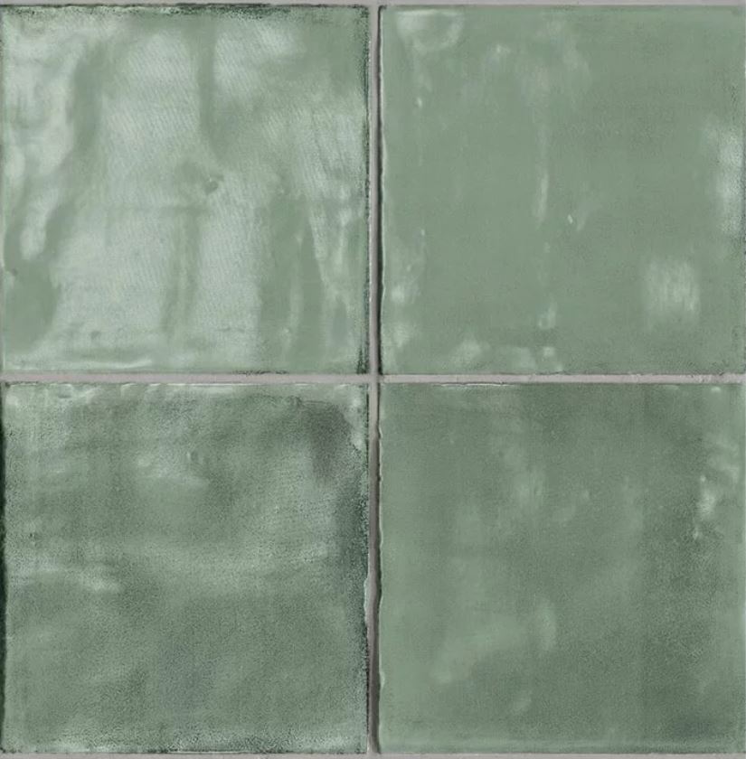
Best Green Tile Finishes
 Mood Board made with Canva Template
Another fun way to introduce green colors in your space is through wall and floor tiles. Most of these tiles are possible options for kitchens, bathrooms, or even accent walls for your house or selected commercial spaces. In a past project, I would use green tiles with sheen (mainly porcelain and glass mosaic tiles) to create an accent feature or a focal point of interest, such as kitchen backsplash, shower walls, vanity walls for bathrooms, and other spaces of interest.
It worked well, and I would say that green-colored wall features aren't for everyone. Still, you can achieve sophistication and timeless style with these finishes and colors when used correctly and combined well with complimenting elements.

Let's start with one of the most exciting tiles invented (I'm sure not all of you will agree with me, but I like mosaic tiles). You can use these glass penny mosaic tiles on floors, walls, and wet areas, and they are also suitable for indoor and outdoor locations. What I like about these tiles is the richness of color and the right amount of sheen, making them perfect for bathroom and kitchen backsplash installation. Also, I thought these gorgeous mosaic tiles were perfect for coffee shops and accent walls for any commercial spaces.

Our second wall tile is the kind of tile that creates a dramatic effect (like a work of art or a perfect wall feature) when installed. It comes with various green tones and shades, making a rustic style wall feature when paired correctly. I thought this tile would look unique to any kitchen backsplash combined with a maple wood cabinet and white quartz countertop. It's super refreshing, vibrant, and looks modern and upscale.
I used this tile in one of our kitchen interior design collections that we currently offer on our website. I love this tile because of the combination of metallic elements and the beauty of cement, which I thought resulted in a marriage of rustic and contemporary styles. Also, each set of tiles is unique and with distinct edges making them look memorable and exciting. This tile will look great for kitchen backsplash and bathrooms when paired with white or black quartz countertop and grey wood tone cabinets.

Image via Rocabu Designs Kitchen Design Collections
Best Green Wallcovering Finishes
 Mood Board made with Canva Template
Now, let's go with one of the most exciting parts of the finishes selections, the wallcovering. Most of the time, I find that the choice of wallcoverings reflects the homeowner's character. There are vibrant wall coverings, out-of-this-world patterns, moody, and wallcoverings to make you calm and sleepy (you know, the boring ones).
There are many options, which is excellent and also makes it hard to select the suitable wallcovering for your room. Still, I assure you that the first or second wallcovering design that captured your attention is always the suitable wallcovering for your space.

The reef wallpaper from Olivia + Poppy comes in both paper and vinyl. I like this wallpaper because of its calming vibe with a magical watercolor effect, and I thought it would look great for bedrooms as an accent wall or nursery rooms as a field wall finish. It seems pretty artistic in a fun way and could also be an exciting conversation wall finish for a powder room.

The Dalston wallcovering is stylish for a dining room or primary bedroom. This worn-out fabric effect reveals gold tones on the emerald green field, which looks sophisticated and fashionable. Even though it seems bold and vibrant, I think it would be an excellent finish for color blocking with vibrant yellows, orange, black, or gold. The type of wallcovering is too sexy for only one wall, and it deserves to be on all divisions in the room.

Finally, our third wallcovering is called Treasure- Balthasar by Koroseal. It is a very interesting wallcovering because of its exotic look; you can almost feel the texture just by looking closely at it. I like the color and texture of the wallcovering; it has animal-like scales (almost like a gecko's skin), making it bold, sophisticated, and looking high-end. I thought this particular wallcovering is the right choice for powder rooms, accent walls for bedrooms, and entertainment rooms.
The color green isn't for everyone, just like yellow and black, which have particular audiences. There are many reasons why we need to add green to our surroundings. It could help us with our emotions through color psychology, heal us physically, mentally, and spiritually through Chromotherapy, or it has something to do with our own experiences in which we find calm and inspiration by having it in our surroundings.
Whatever our reason is, there is no right or wrong way of using the color green in your space. Other people might not like how you used it or combined it with different colors, but, who cares, that's your space, and at the end of the day, you will be the one to experience and use it. As a designer, I always value people's emotions and wonder how they express their feelings through visions and goals for their space. I think that's what's great about my profession; I see the problem, the process, and ultimately the outcome from these emotions, and the results are always personal, memorable, and unique to homeowners.
In conclusion, the color green is an essential part of the interior design world and our lives in general. It makes me smile and sometimes makes me want to puke because it reminds me of mashed broccoli. However, I know from experience that the color green will remain in the design industry, similar to the year-by-year beautiful summer that brings us a vibrant landscape with green tree leaves, tall grass, and blooming flowers.
Thank you for stopping by and reading my blogs. I aim to impart more than a decade of design (primarily interior designs) knowledge and experience through reviews, tips, inspirations, and DIYs. I hope you enjoy your time here as much as I enjoy writing my blogs; feel free to comment below, email me at rbutaran@rocabudesigns.com, or subscribe to our newsletter for fresh blog updates.
Together, let's create meaningful and beautiful spaces.
Ron

2 comments
I look forward to brand new updates and will sh?re this b?og with my F??ebook group.vector art
I look forward to brand new updates and will sh?re this b?og with my F??ebook group.vector art
