Getting Behind the (Color) Wheel
The language of color is universal. It connects to individuals on an emotional and psychological level; it is associative and symbolic. Hence, it is a given that in all creative and artistic fields, the understanding and knowledge of color is a must. Specifically for architecture and interior design, color drives not just the aesthetic of a space but more importantly, the sensory experience a designer wishes to evoke on the end user.
Setting the Tone
For architects and designers, color selection plays a vital role in setting the tone or ambiance of a space. It is especially important in environments that are meant to look out for a person’s welfare, such as health care and educational facilities, senior homes, psychiatric and correctional facilities, among others. For instance, hues of green evokes tranquility and relaxation, and thus perceived to help in a patient’s rehabilitation and improvement.
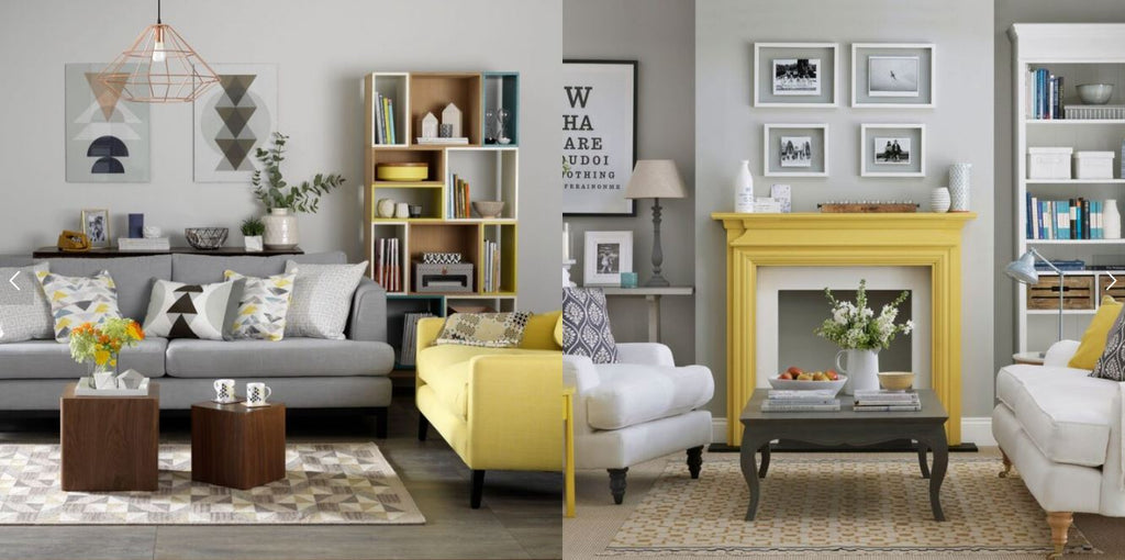
Color is also used to separate spaces that serve contrasting functions, such as parts of the house. Neutral, beige tones will be great for hallways and common areas because they exude a warm welcome. For a home office, bright colors such as red and yellow can be used to help create the feeling of energy, positivity and excitement.
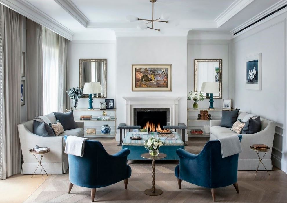
Visual Effects
Color can show a certain volume or constructive detail, or visually mimic certain aspects of space. Applying certain colors on different surfaces can create a perception of depth, height or length. A darker shade of paint on the ceiling gives the illusion of a lower space. Using the same color on the walls and ceiling may give the perception of a wider, expanded space. Paint only the lateral walls, and a narrowing effect can be seen.
With color, a designer has a creative and cost efficient way of playing around with an area without having to change an existing structure.
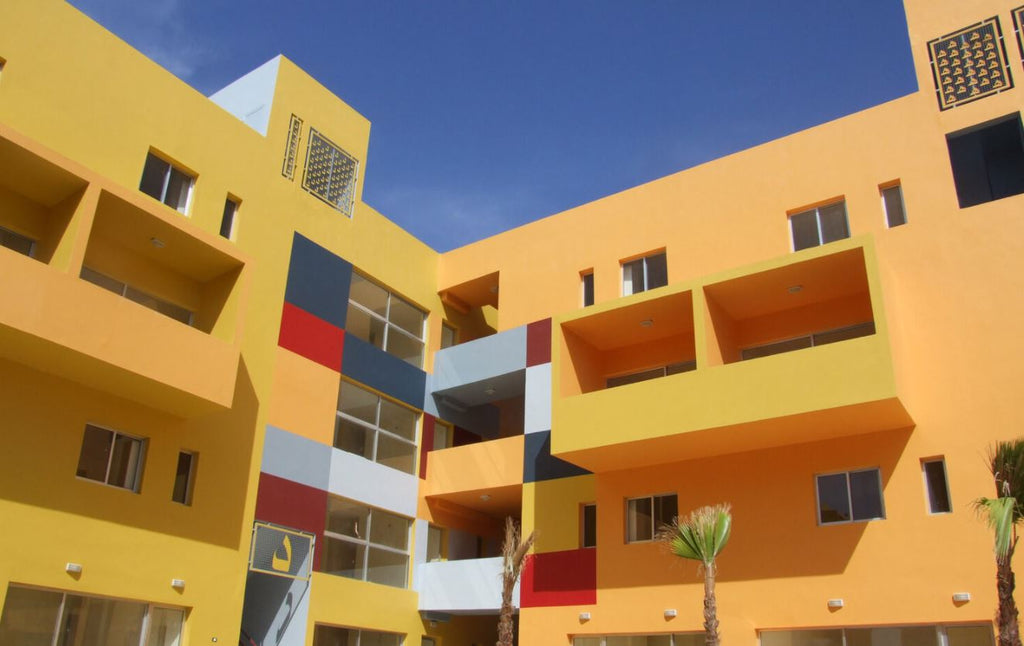
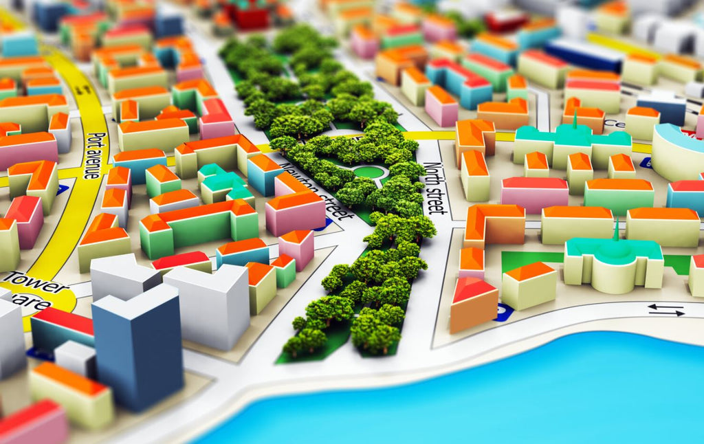
Cityscape and Urban Spaces
In urban projects, colors are sometimes used to restore liveliness and to renovate deteriorated spaces. Aside from the obvious aesthetic value it adds to a place, color helps shape the identity and sense of belonging in the residents. It can give a new image and creates favorable perception of the surroundings among observers.
Determining a color plan for a city is not an easy feat. Intensive research should be done based on climate, history, culture and a place’s identity. In addition, since color perception is unique to each individual based on personal experiences, an architect and designer has the difficult task of considering the color effect of every element of a building construction or public space and ensure there is a balance to the message it will send across.
Psychology of Color
While each person reacts differently to certain colors, there are known generalizations based on empirical studies. Here are the most common colors and their general associations and effects.
-
Red - excites and stimulates; strength, dominance
-
Orange - excites; vibrancy
-
Yellow - uplifts; radiance, positivity
-
Green - relaxing; refreshing, nature
-
Blue - soothes and relaxes; calming, comfortable
-
Purple - subdued; extravagant, luxurious
-
Brown - subdued; security
-
Grey - calming, neutral
-
Black - sleek, sturdy
-
White - clinical; clean, bright
Color Trends for 2021
Because of the chaotic, pandemic ridden nature of last year, it is understandable that 2021’s color trends are geared towards warmth, comfort, calm and positivity. There are two Pantone colors: Ultimate Gray and Illuminating.
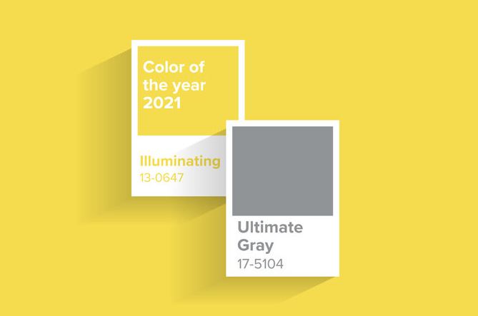
The union of the two is one of strength and positivity. It sets the tone of combining calm hues with a nice bright pop of color - reflecting the need for more serenity and comfort in our daily lives, with just the right amount of uplifting and energizing tones to keep us going forward. Paint companies such as Dulux , Behr and Benjamin Moore and their color trends for the year and are aligned in this direction too.
Color is obviously a powerful tool in architecture and design. In addition to beautifying or manipulating a space, it conveys messages, evokes certain emotions and completes the experience for the end user. It is an important part of the design process and should be utilized with these effects in mind to properly achieve a space’s functionality and purpose.
